PAP Magazine Cover: Architectural Abstraction in Graphic Design
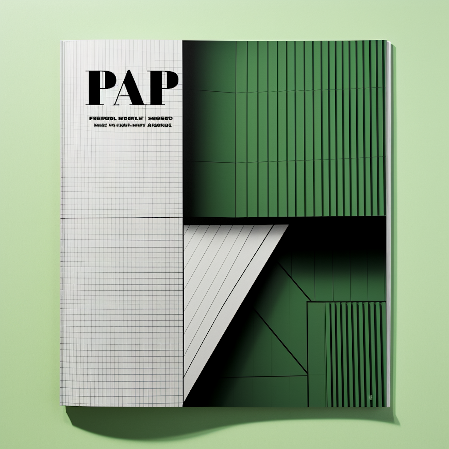
The image presents a modern, stylistic graphic design that resembles a magazine cover with an abstract architectural theme. The main subject of the image is the magazine cover with the word "PAP" prominently displayed in bold, black lettering at the top, with a subtitle in smaller text that reads "PERSONAL PROPERTY SECURED MAKE HEALTH SAFETY ACCESSORIES." The magazine cover is divided into two main sections: one features a grid pattern similar to graph paper, and the other shows a geometric arrangement of green-toned vertical lines that give the impression of a three-dimensional architectural space. The striking contrast between the graph paper section and the vivid green architectural lines creates a visually stimulating composition. The use of shadow and lighting in the green section enhances the sense of depth and volume, while the simplicity of the lined grid balances the composition with a sense of order and precision. There is a subtle interplay of white and green colors, with the green tones dominating the right side of the cover and giving it a sleek, corporate feel. There are no humans or other discernible objects present; the cover relies solely on graphic elements to convey its aesthetic. This minimalist but bold design approach provides a sense of contemporary professionalism and hints at themes of security, healthcare, and design innovation. The image captures the essence of modern graphic design where abstraction and typography come together to create a strong visual statement.
The image presents a modern, stylistic graphic design that resembles a magazine cover with an abstract architectural theme. The main subject of the image is the magazine cover with the word "PAP" prominently displayed in bold, black lettering at the top, with a subtitle in smaller text that reads "PERSONAL PROPERTY SECURED MAKE HEALTH SAFETY ACCESSORIES." The magazine cover is divided into two main sections: one features a grid pattern similar to graph paper, and the other shows a geometric arrangement of green-toned vertical lines that give the impression of a three-dimensional architectural space. The striking contrast between the graph paper section and the vivid green architectural lines creates a visually stimulating composition. The use of shadow and lighting in the green section enhances the sense of depth and volume, while the simplicity of the lined grid balances the composition with a sense of order and precision. There is a subtle interplay of white and green colors, with the green tones dominating the right side of the cover and giving it a sleek, corporate feel. There are no humans or other discernible objects present; the cover relies solely on graphic elements to convey its aesthetic. This minimalist but bold design approach provides a sense of contemporary professionalism and hints at themes of security, healthcare, and design innovation. The image captures the essence of modern graphic design where abstraction and typography come together to create a strong visual statement.
Views
Downloads
Collected